
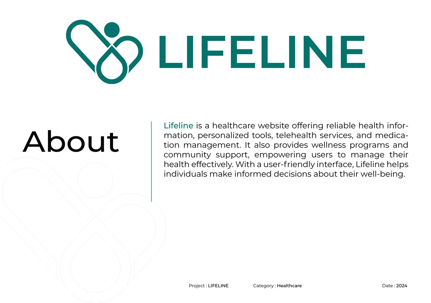
Lifeline – Branding Design for Healthcare Service
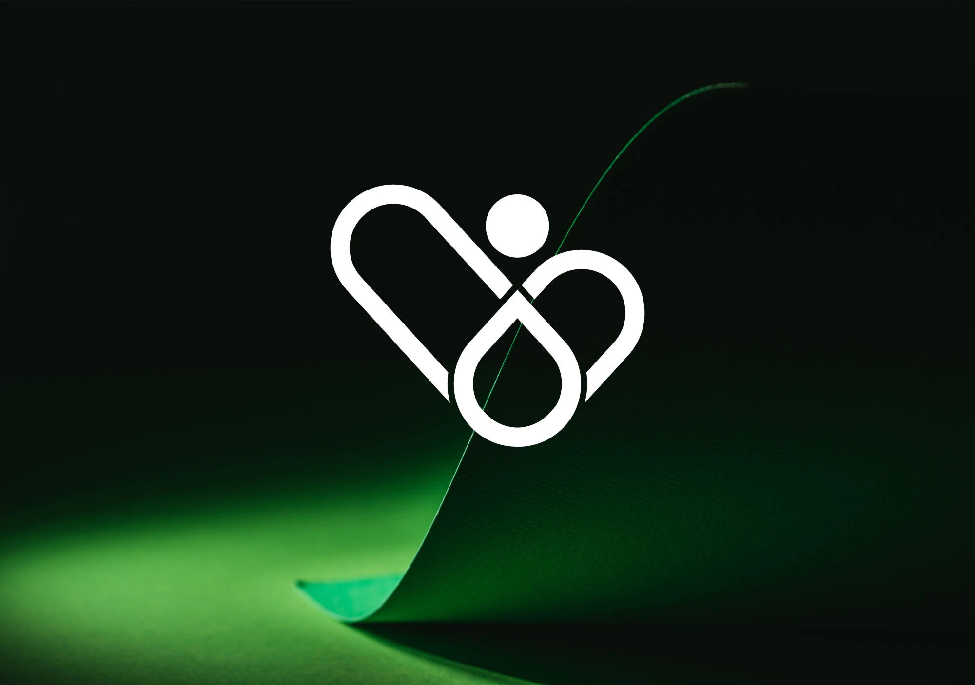
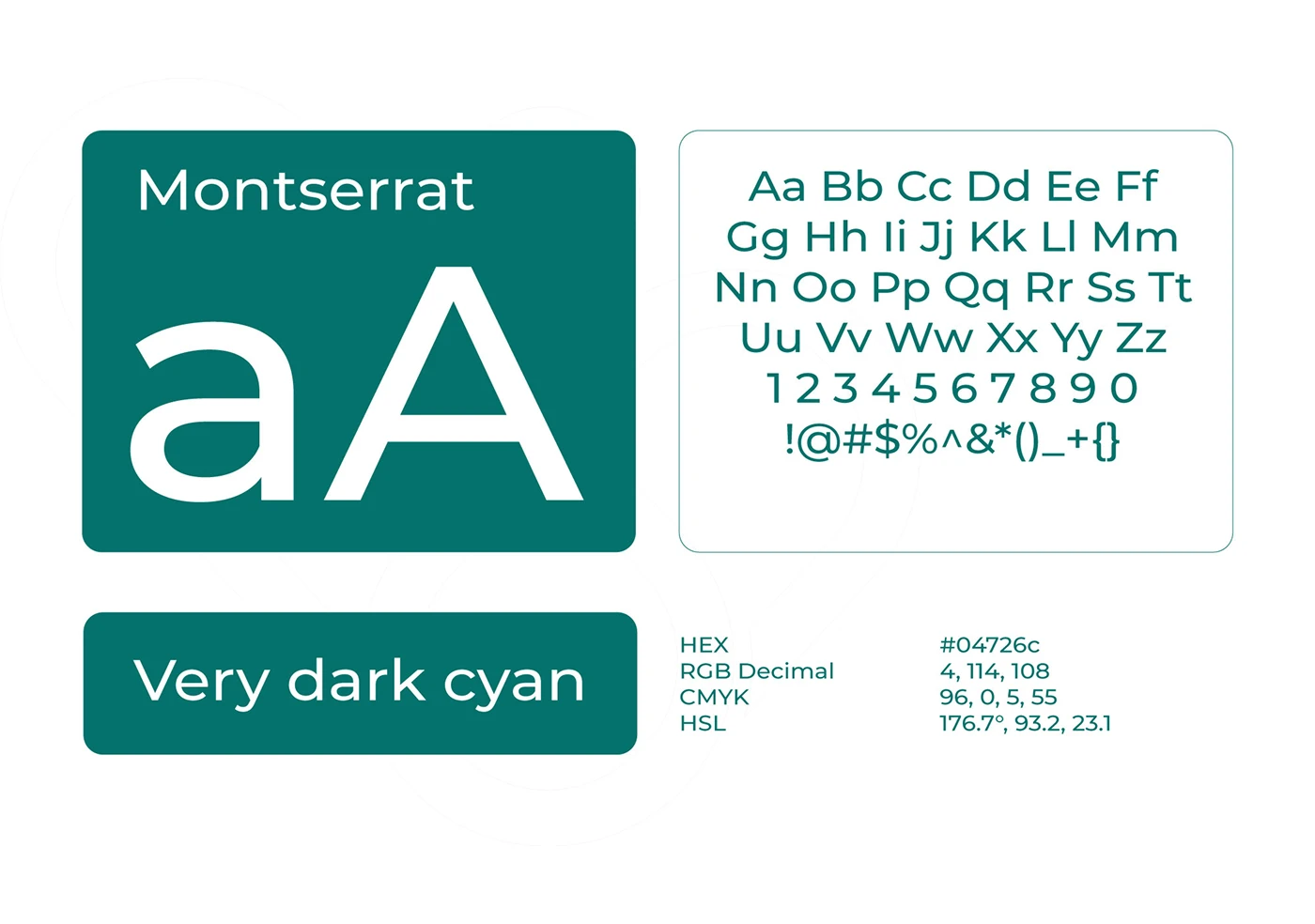
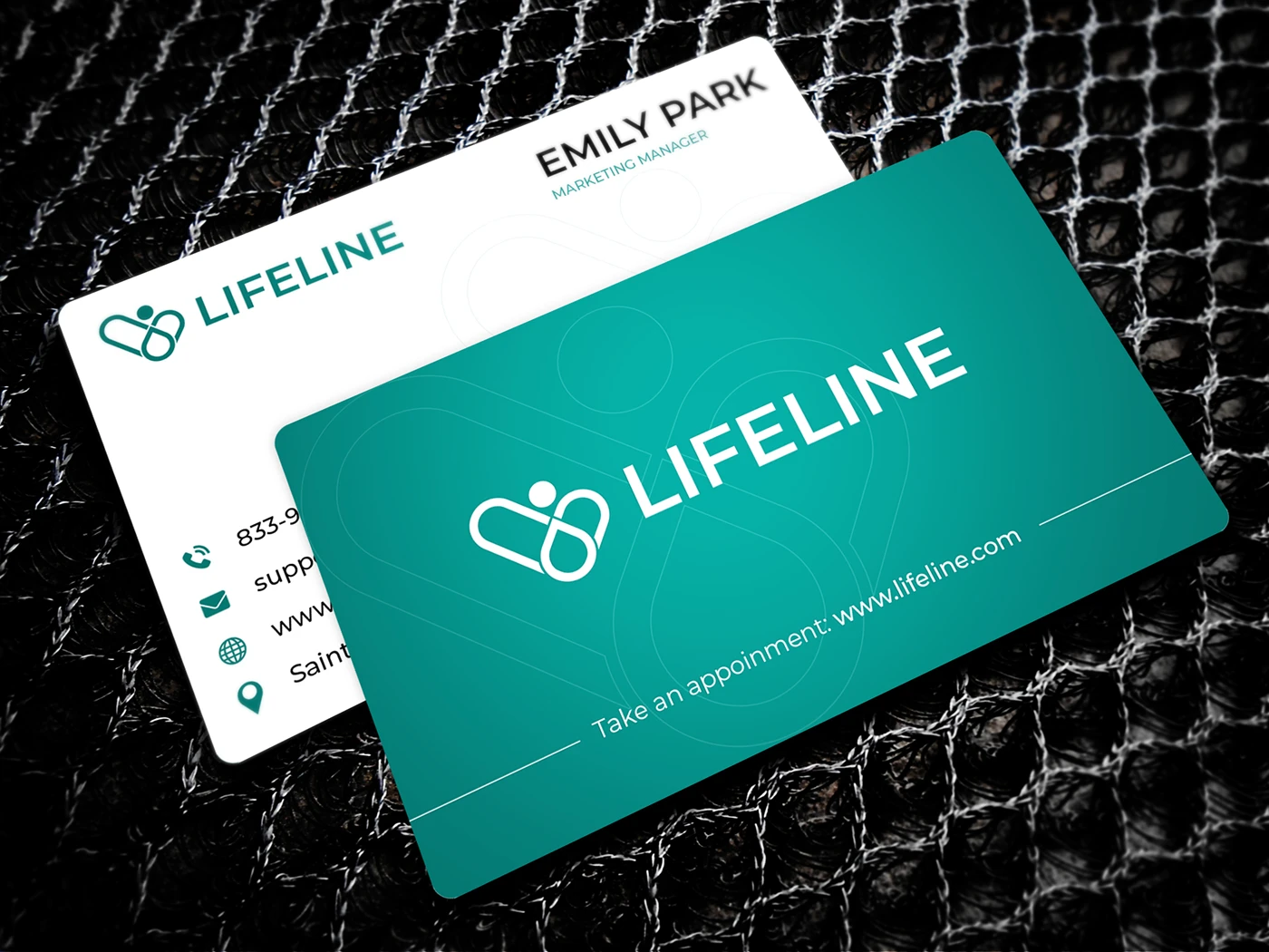
Lifeline is a modern healthcare service brand designed by Raddito with a calm, clinical tone and a friendly human feel, built to communicate trust, safety, and care through a clean symbol, clear typography, and a controlled green palette that feels healthy and reassuring.
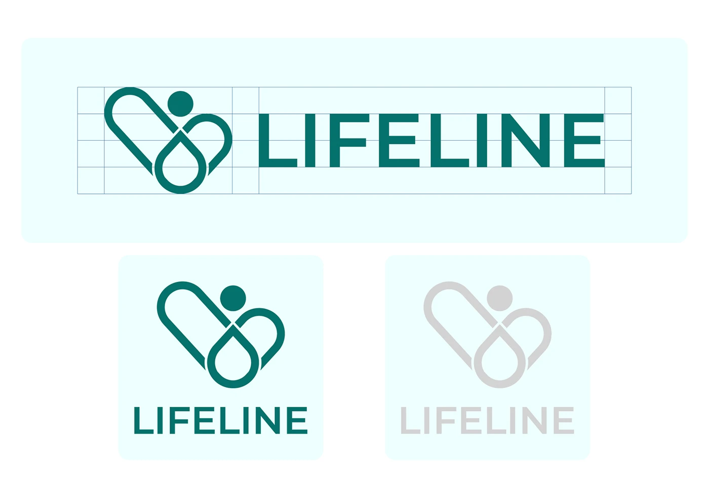
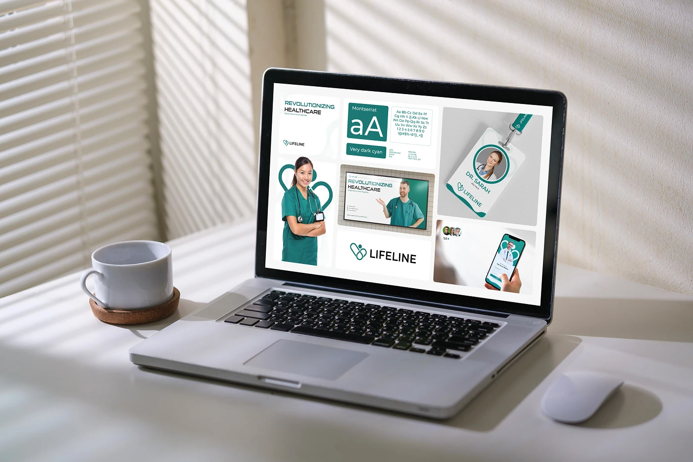
The core identity system focuses on simplicity and repeatability, with a flexible logo set, icon style, type pairing, and color rules that stay consistent across print and digital use, so the brand looks familiar whether it’s on a prescription-style document, a clinic banner, or a mobile interface.
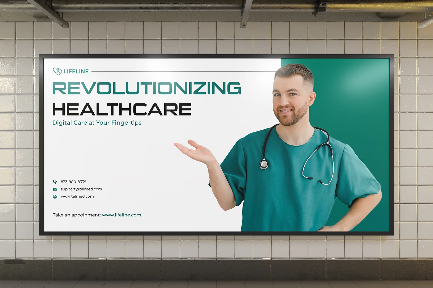
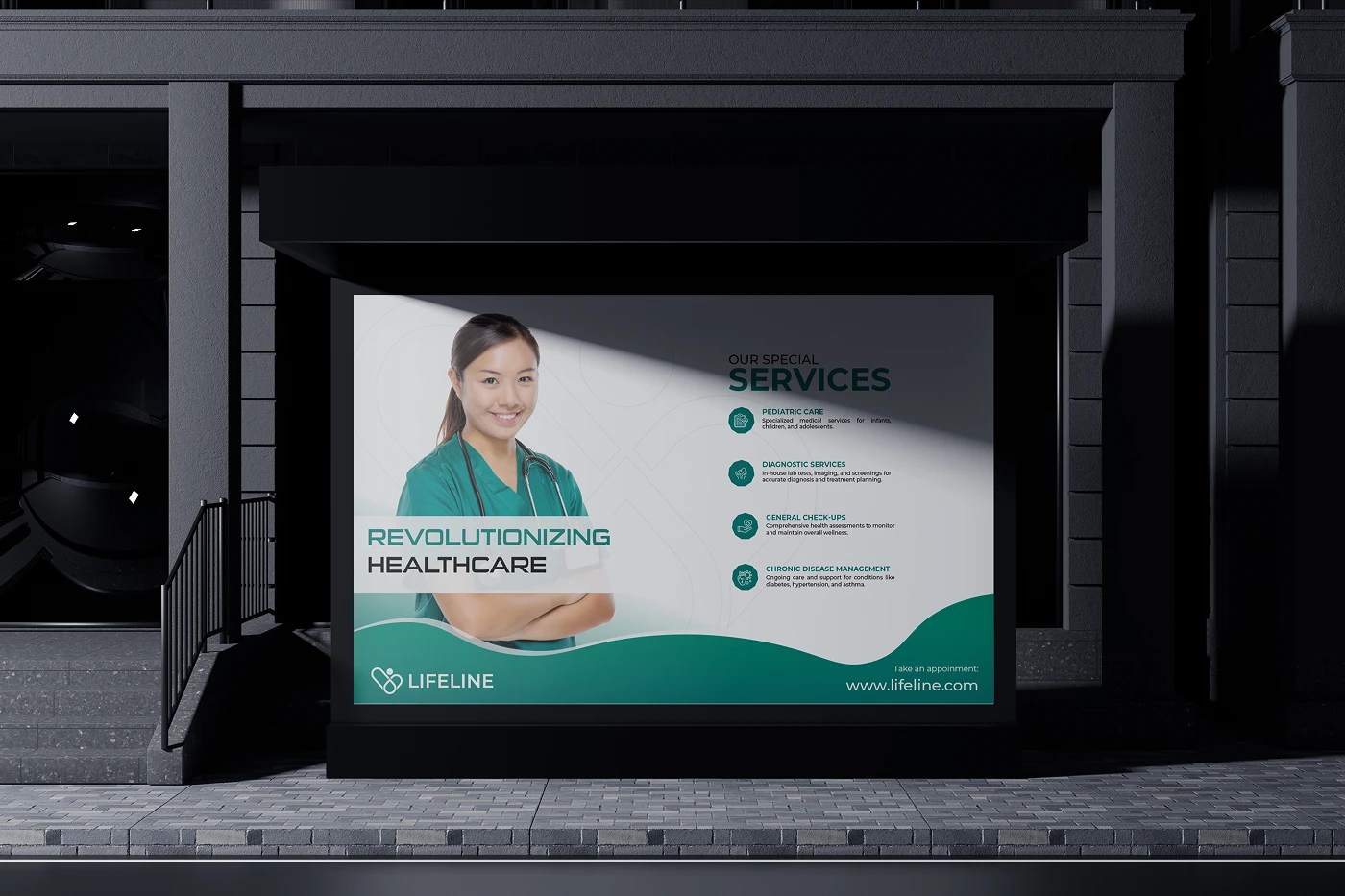
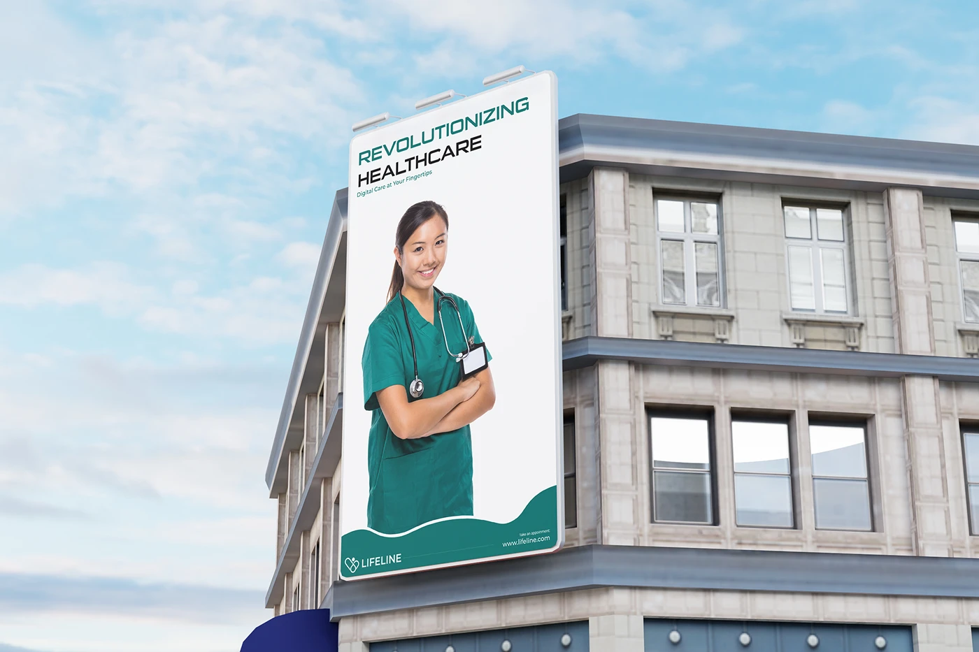
To validate the identity beyond mockups, Lifeline was placed into real-world advertising and clinic-style visuals such as posters and outdoor placements, keeping contrast strong and layouts readable from a distance while maintaining a professional healthcare presence.
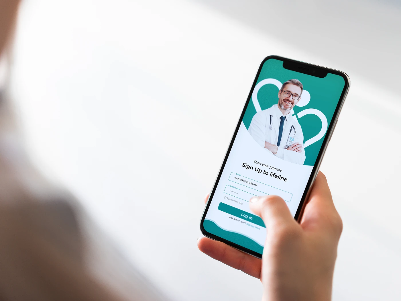
A dedicated website template was created to present services, trust signals, and patient actions clearly, using spacious sections, simple navigation, and responsive structure so visitors can understand what Lifeline offers and take the next step without friction.
 View Live Demo
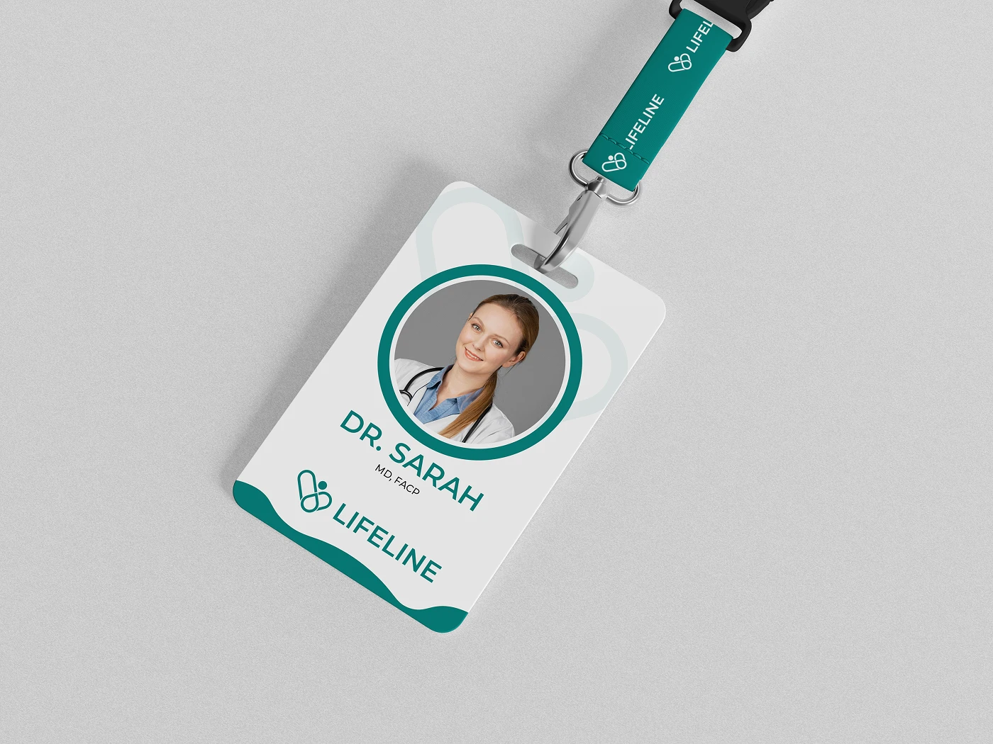
Supporting assets like ID cards, signage-style pieces, and branded materials were designed to extend the system into everyday operations, helping staff look consistent and organized while reinforcing credibility at every touchpoint patients interact with.
Lifeline brings identity, real-world usability, and a clean digital experience into one cohesive brand system—designed by Raddito to stay consistent across clinics, campaigns, and daily healthcare workflows.