
ShiftXpress – Brand Design for House Moving & Relocation Agency
ShiftXpress is a bold and energetic relocation brand designed by Raddito to represent speed, reliability, and confidence in house relocation services, with a visual identity that feels modern, action-driven, and instantly recognizable across logistics, transport, and customer-facing environments.
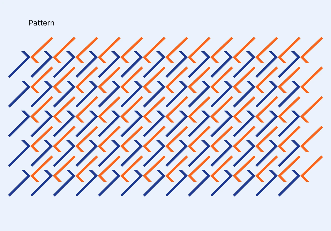
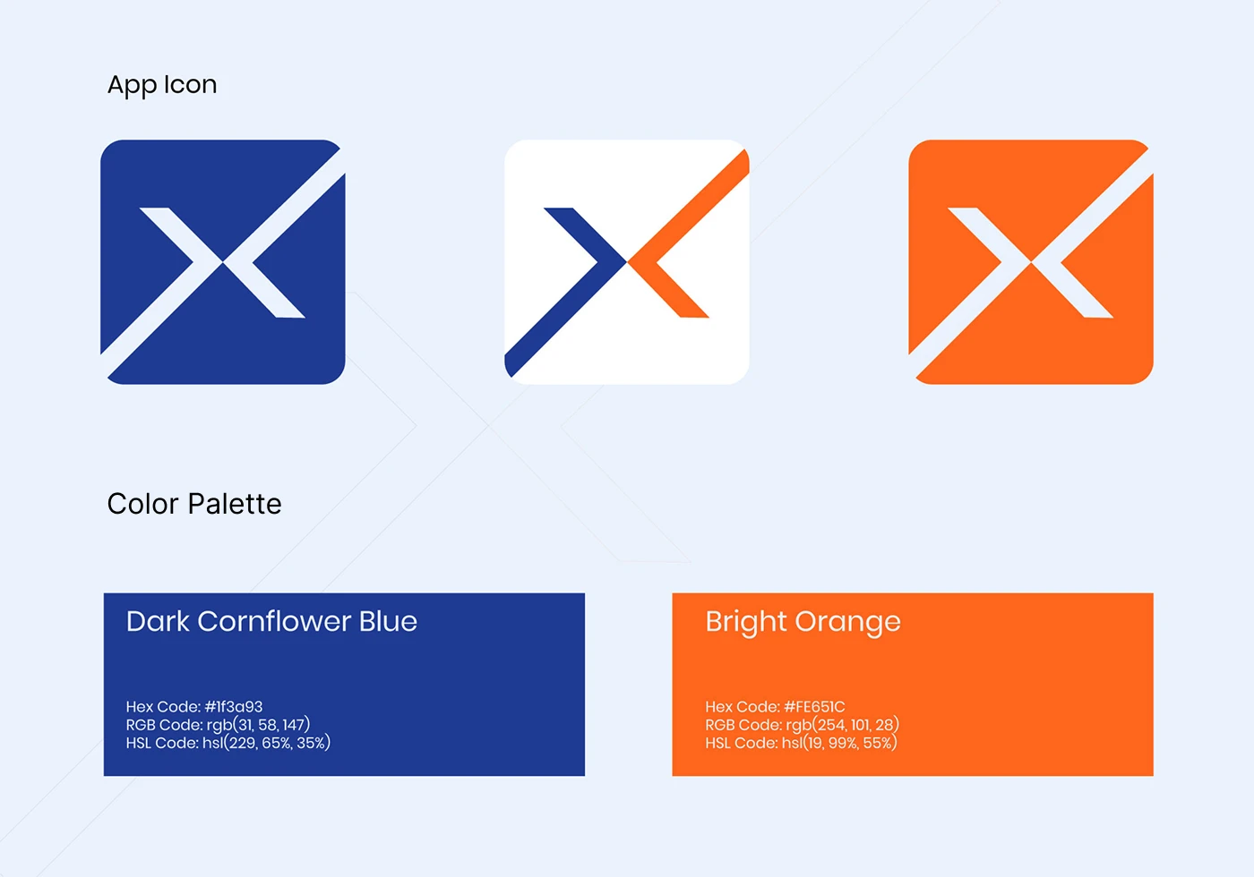
The brand identity was built around motion-inspired forms, sharp geometry, and high-contrast color usage to communicate efficiency and momentum, ensuring ShiftXpress delivers a strong visual signal of trust, professionalism, and operational strength in a competitive relocation market.

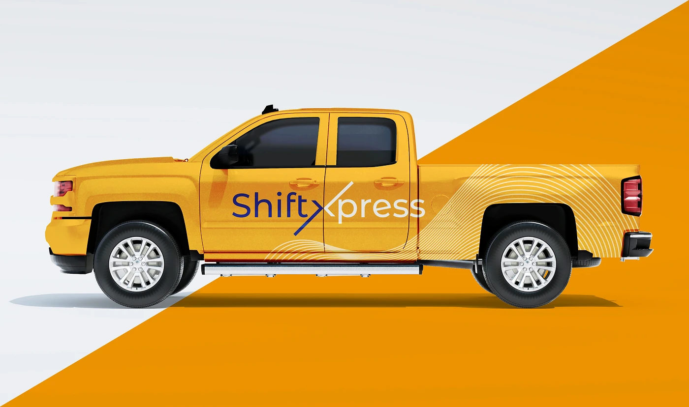
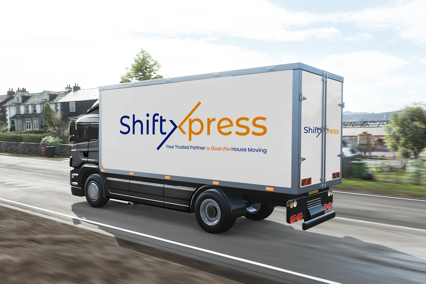
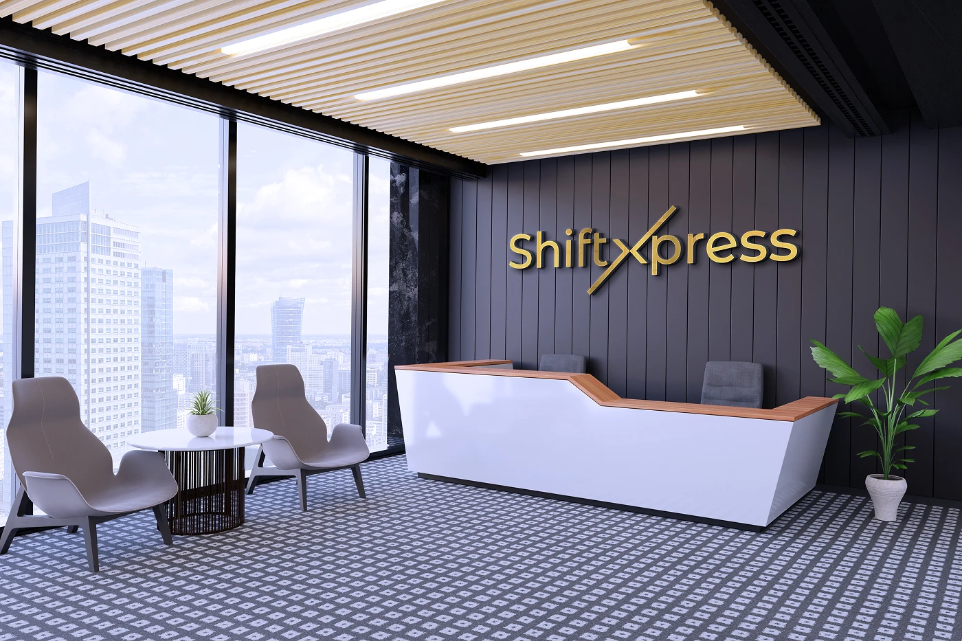
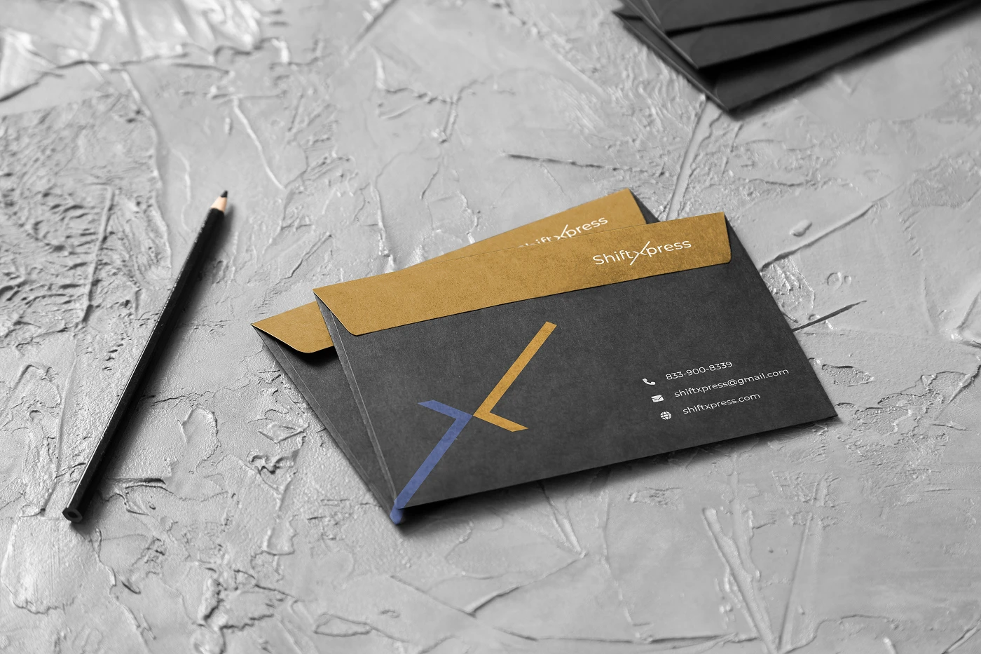
ShiftXpress’s visual system extends across vehicle branding, office signage, outdoor advertising, and operational materials, creating a consistent and impactful presence that reinforces brand visibility while clearly communicating service reliability at every physical touchpoint.


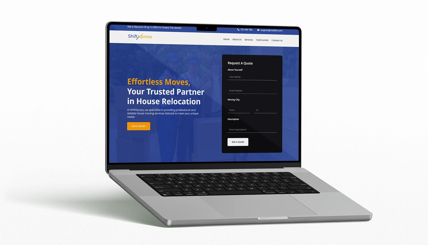
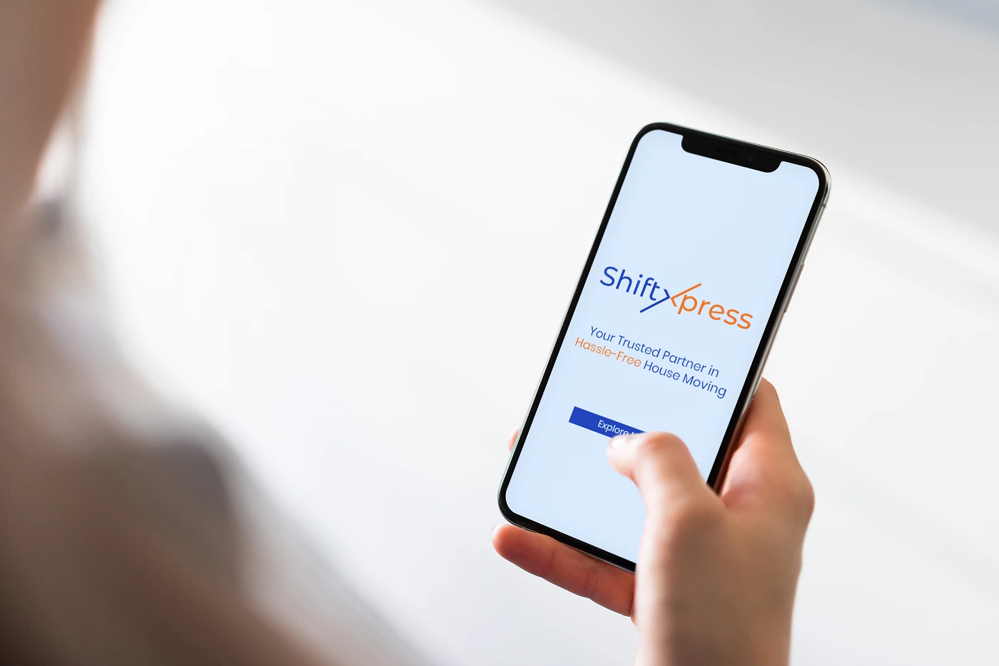
A dedicated website template was designed to translate the ShiftXpress brand into a fast, structured digital experience, supporting service clarity, lead generation, and customer confidence while maintaining consistency with the brand’s energetic visual language.
 View Live Demo
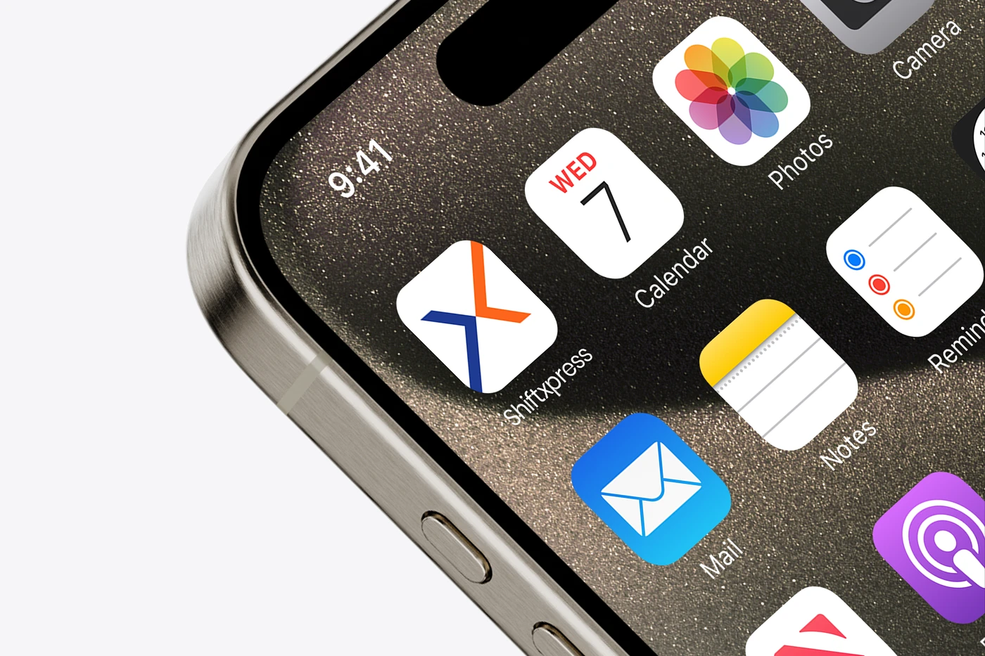
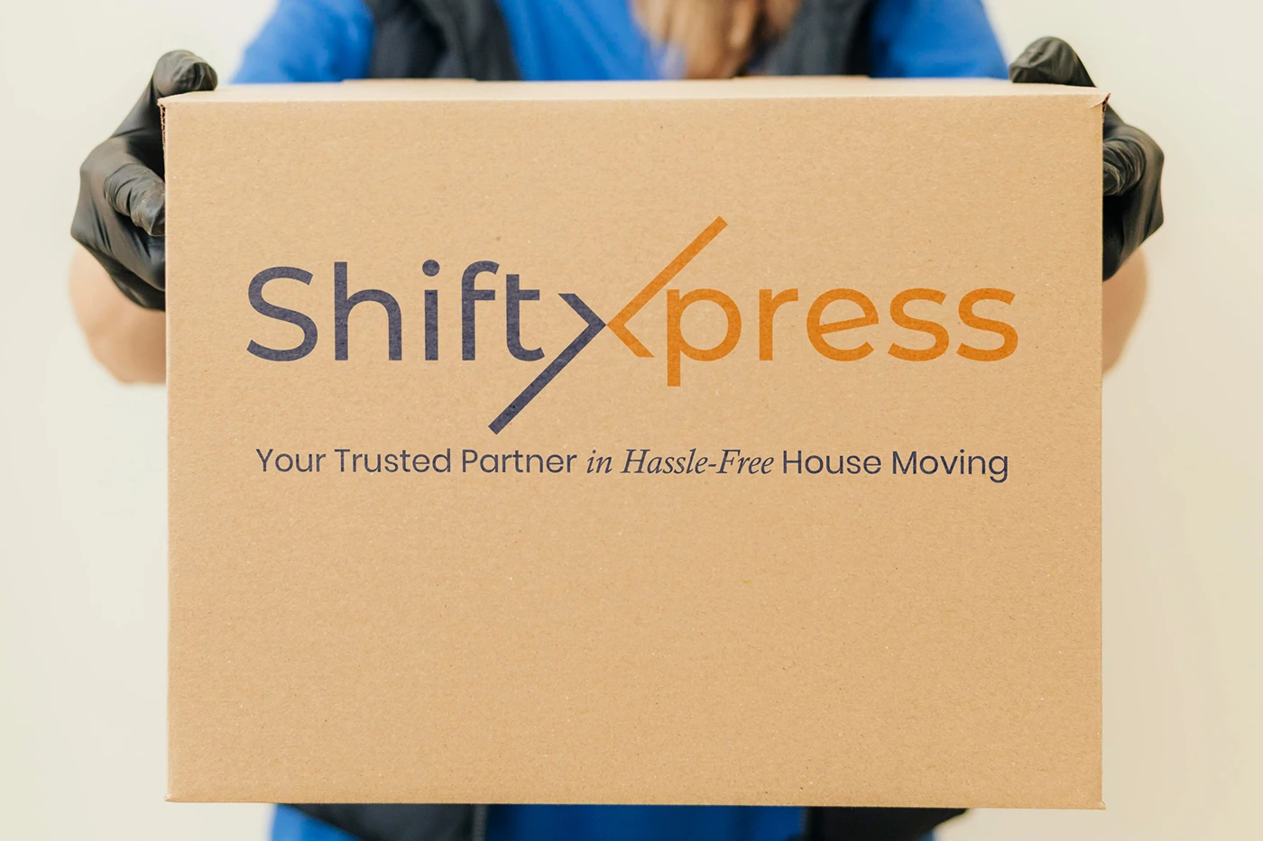
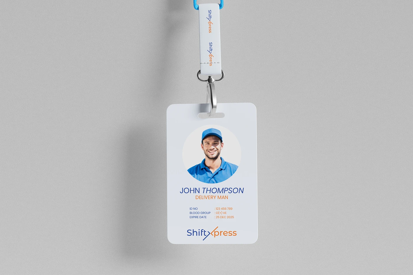
From uniforms, ID cards, and packaging to mobile interfaces and service documentation, the ShiftXpress brand system was applied across essential customer touchpoints to ensure every interaction reflects professionalism, efficiency, and ease of service.

ShiftXpress was designed by Raddito as a cohesive relocation brand system with a dedicated website template, built to support strong brand recognition, operational clarity, and scalable growth across both digital platforms and real-world service environments.